Convert RGB to CMYK in Illustrator: Easy Guide
Did you know over 80% of printed materials use the CMYK color model? This is true for magazines and marketing materials. Knowing how to switch RGB to CMYK in Illustrator is key for perfect print colors. It helps avoid expensive mistakes.
As a designer, I often struggle to make screen colors work for prints. This guide will show you how to change color modes in Adobe Illustrator. Your designs will look amazing on paper, just like on screen.
Key Takeaways
- CMYK is the preferred color mode for print design, while RGB works best for digital screens.
- To convert to CMYK in Illustrator, navigate to File > Document Color Mode and select CMYK.
- Color shifts can occur when translating certain RGB colors to CMYK.
- It’s important to adjust your colors after conversion for optimal print quality.
- Not all software can convert RGB to CMYK, making Illustrator a powerful tool for designers.
Understanding RGB and CMYK Color Modes
In today’s digital world, knowing about color modes is key for designers. Each mode has its own use and works best with certain mediums. RGB and CMYK are two main color models, each with its own strengths.
What is RGB?
RGB stands for Red, Green, and Blue. It’s an additive color model that works well in digital spaces. This means screens can show a wide range of colors.
RGB is great for digital art and websites. It lets you create over 16 million colors. But, online platforms usually need RGB images, so CMYK images often need to be converted.
What is CMYK?
CMYK, on the other hand, uses Cyan, Magenta, Yellow, and Key (Black). It’s a subtractive color model made for print. It ensures colors look right on paper.
CMYK can’t match RGB’s color range. But, it’s best for ink-based printers. Print shops prefer PDFs in CMYK for the best print quality.
Knowing when to use RGB or CMYK is important. RGB is best for digital, while CMYK is for print. Tools like Adobe Photoshop and Illustrator make switching between them easy.
If you’re interested in AI in art, check out this resource. It shows how AI can change creative work.
Importance of Converting RGB to CMYK for Printing
It’s crucial to know how to change RGB to CMYK for print design. RGB is great for digital screens because it has a wide range of colors. But CMYK, which uses Cyan, Magenta, Yellow, and Black, is better for printed materials. This is because some bright colors don’t look the same when printed.
Why Use CMYK for Print Design?
CMYK is key for print design because it makes colors look right in print. Designing in CMYK helps avoid color problems. At first, I had trouble with RGB to CMYK conversion, leading to color shifts.
Files like AI and PDF work better in CMYK. This ensures printed images match their digital versions.
Potential Color Issues When Printing from RGB
Colors might lose their brightness when switching from RGB to CMYK. RGB adds colors, while CMYK subtracts from white. This can cause some colors to disappear.
It’s important to fix color mismatches and test before printing. For tips, check out this RGB to CMYK printing advice discussion on forums.
When to Use RGB and CMYK?
Choosing between RGB and CMYK is key for your design project. Knowing when to use each is crucial for great results. The media type decides which color mode to use. RGB is for screens, while CMYK is for prints.
Starting with the right color profiles saves time and trouble. This is important for both digital and print projects.
Best Practices for Digital vs. Print Media
RGB stands for Red, Green, and Blue. It’s for digital screens. It offers a wide color range, perfect for digital projects like websites.
CMYK, on the other hand, is for prints. It includes Cyan, Magenta, Yellow, and Key (Black). Print shops prefer PDFs in CMYK for accuracy.
To get the best print results, use CMYK in Illustrator. Starting with CMYK ensures closer color accuracy. Remember, adjusting CMYK colors can be harder than RGB.
These tips help you work well with both digital and print media. They ensure your projects look as intended.
Differences Between RGB and CMYK Color Models
It’s important to know the difference between RGB and CMYK color models for design work. How colors are made in each model affects how designs look in print and on screens.
Color Creation Process
The rgb color mode uses light to create colors. It mixes red, green, and blue light to make a wide range of colors. This is great for digital media because it produces bright and vivid colors.
The cmyk color mode works differently. It uses cyan, magenta, yellow, and black inks on a white page. This method is good for print but can’t match the bright colors of RGB.
Color Range and Accuracy
The rgb color mode can create more colors than the cmyk color mode. This can cause problems when printing designs. CMYK colors often look less bright than RGB colors.
Designers use software like Adobe Photoshop and Illustrator to fix these issues. They can use settings like North American Prepress 2 or Adobe RGB 1998 to improve color accuracy. For more information, check out this resource on RGB and CMYK differences.
How to Convert RGB to CMYK in Illustrator
Converting RGB documents to CMYK in Adobe Illustrator is key for print quality. Knowing how to change color space transformation ensures your designs look right in print. Follow these steps for a smooth adobe illustrator color conversion process.
Step-by-Step Guide to Conversion
Begin by opening your RGB file in Illustrator. To switch to CMYK, go to File in the top menu. Then, choose Document Color Mode and pick CMYK Color. This change sets your document’s color profile for print shops.
PDFs made from this setting will meet printing standards. This ensures they work well for printing.
Adjusting Colors After Conversion
After switching, you might see color differences. RGB colors are often brighter, while CMYK can look more muted. You’ll need to tweak these CMYK colors to match the RGB ones as closely as you can.
Some RGB colors might not work in CMYK, which can impact print quality. Use the color sliders to adjust shades and keep your design looking good.
Setting Up Your Document in Illustrator
Before starting my design, setting up the document is key. I choose CMYK for print projects. This mode, with Cyan, Magenta, Yellow, and Black, is essential for print shops. It ensures accurate colors in the final product.
RGB is better for digital screens because it has a wider color range. But for printing, CMYK is my go-to 99% of the time. It helps avoid color issues when moving from digital to print.
Illustrator has many modes, like RGB, HSB, and Grayscale. But for print, CMYK is my top choice. Knowing how to set these color settings helps me keep colors accurate and compatible with printing.
For more on changing color modes in Illustrator, check out this resource. It provides great tips for creating top-notch print designs from the start.
Adjusting CMYK Colors for Better Print Quality
In commercial printing, vibrant and accurate colors are key. Adjusting CMYK colors can greatly improve print quality. This ensures the final product meets both personal and commercial standards.
Knowing various techniques is crucial for making dull CMYK colors pop. This allows for a more dynamic look on printed materials.
Techniques to Enhance Dull CMYK Colors
Working with CMYK, I often face dull colors that don’t grab attention. To fix this, I experiment with adjusting individual color values. This can brighten the whole palette.
Using adjustment filters after conversion also boosts color strength and vibrancy. Adding metallic Pantone colors gives that extra pop needed for standout prints. Flattening all layers before conversion helps keep some vibrancy from being lost during the RGB to CMYK switch.
Using Color Profiles for Accuracy
Using accurate color profiles tailored to print needs makes a big difference. Knowing how to work with color profiles ensures CMYK colors match commercial standards. Switching to LAB color mode before converting to CMYK helps keep vibrancy and reduces color shifts.
By mastering these techniques, I meet commercial printing color requirements. This leads to high-quality prints that meet expectations.
Common Tools for Color Conversion in Adobe Software
Adobe software has great tools for color conversion, especially from RGB to CMYK. Each tool has its own special features that help me work better. Knowing these differences helps me pick the right software for my projects.
Utilizing Adobe Photoshop for Color Conversion
Adobe Photoshop is a top choice for color conversions. To switch from RGB to CMYK, just go to Image > Mode. This makes quick changes easy while keeping control over colors. Working with pixels lets me see changes right away, which is key for printed work.
Comparing Illustrator and Photoshop for CMYK Conversion
Adobe Illustrator and Photoshop both handle color conversion well, but differently. Illustrator is for vector designs and lets you change the whole document’s color mode easily. Photoshop is better for raster images and fine color tweaks. The choice depends on whether your project needs vector or raster images.
How to Convert RGB to CMYK in Illustrator: Best Practices
When converting RGB to CMYK, understanding print design color management is key. I make sure my document setup is right to avoid color issues. Adobe Illustrator makes it easy to switch from RGB to CMYK with the “Document Color Mode” option under “File”.
Checking colors often during design helps spot problems early. I use a calibrated monitor to see colors accurately, as they look different in print. This step prevents dull colors after conversion and keeps my artwork bright.
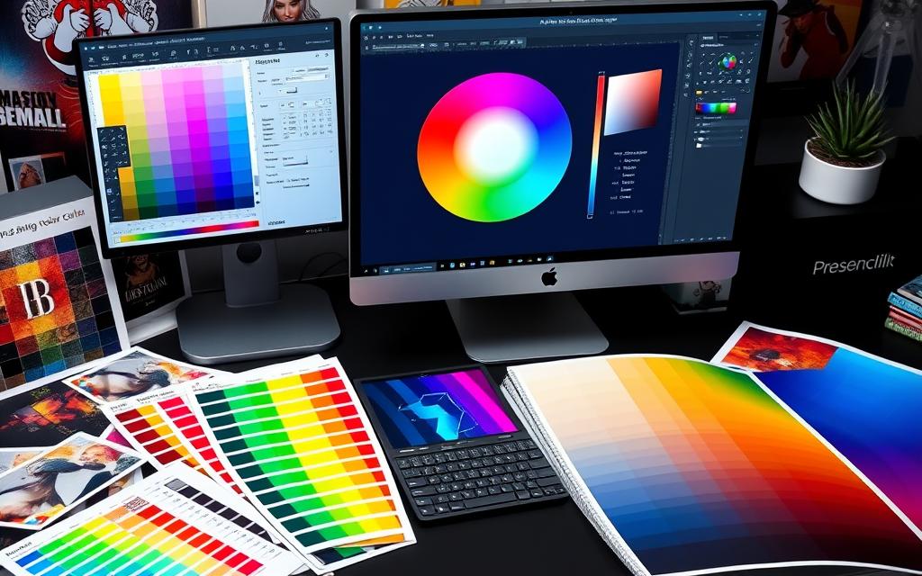
RGB and CMYK colors can look different, but being proactive helps. I adjust colors manually after conversion to make them pop. Looking for warning icons helps me know where to tweak colors further.
Following these best practices ensures my projects meet color standards. With careful preparation and constant checks, I overcome color management challenges. This way, my designs truly connect with my audience.
Prepress Color Adjustment for Commercial Printing
Understanding prepress color adjustment is key for top-notch prints. It’s vital to match commercial printing color standards before printing. Doing proofs helps spot color issues early. This ensures vibrant prints that meet expectations.
In prepress, I tweak colors for the best results. Using Adobe InDesign lets me set colors precisely. It also helps see how colors will look on different papers and under various conditions.
Using ICC profiles for specific papers makes prints more reliable. This keeps the color scheme consistent. A detailed prepress process ensures colors are right and the design looks great in print.
Clear talks with clients are also crucial. Sharing prepress knowledge helps everyone be happy with the final product. This approach cuts down on mistakes, making production smoother.
For more on RGB to CMYK conversion, check out color conversion techniques for prepress quality control.
Adding these steps to my work makes prints look better and work harder. They get the message across more effectively.
Exploring DALL-E prompt generator tools can open up new design ideas. Learn more about AI-generated images here.
Conclusion
Learning how to convert RGB to CMYK in Illustrator is key for graphic designers, especially for print work. This article covered the basics and best practices for color accuracy. It showed how to keep designs true to the original vision when moving from digital to print.
Switching to CMYK mode early helps avoid big color changes later. We looked at tools and steps for converting RGB to CMYK in Illustrator. It’s also important to work with printers to ensure designs are print-ready. This saves time and fixes color issues before they become big problems.
Knowing how to convert RGB to CMYK is crucial for creating amazing print designs. Whether using Adobe Illustrator or Photoshop, mastering this skill makes visuals pop. It’s not just for digital screens but also for physical media.
FAQ
How do I convert RGB to CMYK in Adobe Illustrator?
To change RGB to CMYK in Illustrator, go to “File” > “Document Color Mode.” Then, pick “CMYK Color.” This switch lets you adjust colors for printing.
Why should I use CMYK for print design?
CMYK is best for print because it uses ink colors. This ensures colors look right in print, avoiding issues with RGB colors.
What issues can arise when printing from an RGB file?
RGB colors look brighter on screens than in print. Printing an RGB image without converting can lead to dull prints.
When should I use RGB instead of CMYK?
Use RGB for digital projects like websites. CMYK is better for print to get accurate colors.
How does the color creation process differ between RGB and CMYK?
RGB uses light to create colors. CMYK uses ink to subtract colors from white light.
Can I adjust CMYK colors after converting from RGB?
Yes, adjust CMYK colors after converting to match RGB. This ensures colors look as intended.
What are some techniques for enhancing dull CMYK colors?
To brighten CMYK colors, tweak individual values or use specific profiles. Try different settings for better print results.
Are there specific color profiles I should use for commercial printing?
Yes, use the right profiles for quality prints. Commercial services often provide these to ensure color consistency.
Is it possible to convert RGB to CMYK using Adobe Photoshop?
Yes, Photoshop can convert RGB to CMYK. Go to “Image” > “Mode” > “CMYK Color” to change color mode.
What best practices should I follow when converting RGB to CMYK?
Set up your document correctly to avoid color issues. Check colors often and use calibrated monitors for accurate color.
What are prepress color adjustments, and why are they important?
Prepress adjustments ensure prints meet expectations. This includes color proofs and following commercial printing guidelines to avoid errors.

