Evenly Space Objects in Illustrator: Quick Guide
Did you know using the Alignment menu in Adobe Illustrator can save designers hours? This tool lets you evenly spread out objects with just a click. It changes how we approach design layouts.
If you’ve ever had trouble aligning elements, you’re not alone. Many designers struggle to make their designs look good without the right techniques.
In this guide, I’ll show you how to evenly space objects in Illustrator. This will make your designs look professional and save you time. We’ll cover using the Align panel and how to pick objects correctly. These skills will make your work flow better.
Let’s explore the key features for aligning Illustrator objects. We’ll also look at the best ways to distribute them evenly!
Key Takeaways
- The Align panel is the most efficient tool for distributing objects evenly in Illustrator.
- Selecting objects is crucial before using the Alignment menu for accurate spacing.
- The Vertical and Horizontal Distribute Center buttons allow for precise alignment across axes.
- Alternative methods like grids and snapping can also aid in spacing, but the Align menu reigns supreme.
- Understanding alignment options such as Align to Key Object or Align to Artboard improves design outcomes.
Introduction to Spacing in Illustrator
Learning about spacing in Illustrator is key to making great designs. Evenly spaced objects make designs look better and work better. This is true for things like navigation bars or ads. Illustrator’s spacing tools make it easy to get this look, saving time and effort.
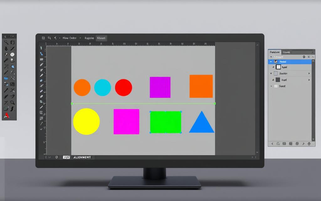
When I work on spacing out Illustrator elements, I see how it makes designs look and work better. The Align Panel is my favorite tool for arranging objects. It has features like Align To, Align, and Distribute Objects, all important for spacing.
Understanding Alignment vs. Distribution
Learning the difference between alignment and distribution in Illustrator is key for great designs. To align illustrator objects means placing them next to each other or the artboard. I use horizontal alignment to line up objects on the left, center, or right. Vertical alignment adds more precision, allowing me to place objects at the top, middle, or bottom.
Distribution, on the other hand, is about making sure objects are evenly spaced. The distribute objects illustrator feature is essential for designs with more than two objects. It ensures they are spread out evenly, which is crucial for designs that need to look consistent and appealing.
The Align Panel offers many options for aligning and distributing objects. It’s easy to find in the Window menu or Control panel. Using Align to Key Object as a reference point makes my alignment tasks easier. Knowing these differences has improved my workflow and avoided alignment mistakes in my designs.
For accurate work, I often use Smart Guides. They help with aligning and distributing objects by giving visual hints during editing. Mastering these tools has greatly increased my productivity and the quality of my designs.

How to Select Objects for Spacing
Choosing objects well is key to a balanced design in Adobe Illustrator. Learning to pick multiple objects and a main object helps a lot. These skills make managing objects easier and keep my designs precise.
Highlighting Multiple Objects
To highlight many objects, I use the selection tool to drag around them. Holding the Shift key lets me pick specific items. This method is great for aligning or spacing objects evenly in my designs.
It’s important to know that at least two objects are needed for alignment or distribution. This makes my design work smoother.
Selecting a Key Object
Choosing a key object is crucial for focusing on a specific part of the design. After picking my objects, I pick the main one I want to align with. Holding the Shift key and clicking on it again makes it stand out.
This ensures all other objects align or spread out evenly around it. By getting good at these selection techniques, I can handle complex designs better. Check out this detailed guide for more tips.
Using the Align Panel for Distribution
The illustrator align panel is a key tool for precise object distribution in designs. It’s vital for aligning multiple items for a polished look. This section explains how to use the Align Panel and its distribute options to improve design workflows.
Accessing the Align Panel
To open the Align Panel, go to the Window menu in Illustrator. Choose Align to access alignment and distribution tools. This is crucial for aligning objects to the artboard or each other. Shortcuts can make this process faster.
Choosing Distribute Options
With objects selected, I can pick from various distribute options in the Align Panel. Options like Horizontal Distribute Center and Vertical Distribute Center space objects evenly. This saves time and ensures my work looks professional. For more tips, see this resource on aligning and distributing objects.

The illustrator align panel and its distribute options make keeping designs consistent easy.
How to Evenly Space Objects in Illustrator
To make your designs look great in Adobe Illustrator, it’s key to know how to space objects evenly. This makes your designs look better and saves time when you need to make changes. The Align panel makes it easy to distribute spacing without manual adjustments.
First, pick the objects you want to space out. Choosing a main object is important because it sets the spacing for the others. Then, enter the spacing you want in pixels in the Align panel. For example, if you want 50px between objects, just type that in.
After setting your options, click the Horizontal Distribute Center button. Illustrator will then spread the objects evenly based on your input. Grouping the objects keeps them together before you ungroup them if needed.
This method makes my design work easier. I often check out detailed guides, like the one here, for more tips on spacing. Learning how to evenly space objects in Illustrator changes how I design, making my work cleaner and more organized.
Exploring Smart Guides in Illustrator
Working in Illustrator, I’ve found that smart guides are key for precise alignment and spacing. They show up as green or magenta lines when I move objects. This makes my workflow smoother, letting me align objects easily without manual tweaks.
To turn on smart guides, I just go to the View menu and choose it. This feature makes sure my designs look good and are put together right. It shows me how objects relate to each other, ensuring they’re spaced out well.
Using smart guides has changed how I do alignment tasks. I can see where things need to be aligned, making quick changes. This boosts my efficiency and helps me create a better final product.
Distributing Objects Using the Step and Repeat Method
The step and repeat method is a quick way to spread out objects in Illustrator. It lets me make the same objects over and over, keeping them evenly spaced. This is great for projects that need lots of the same design, like logos or patterns.
Creating Identical Objects
To make the same objects fast, I use special keyboard shortcuts. First, I pick the object I want to copy, making sure it’s centered right. Then, pressing Ctrl + D on Windows or Command + D on Mac duplicates it, keeping it evenly spaced. This method is also useful for making things like clock marks, where I just group and duplicate lines, then rotate them.
Benefits of the Step and Repeat Feature
Using the step and repeat method makes my design work better. It helps me make designs that are neat and organized. This way, I can spend more time on creative parts of my project. Illustrator’s tools let me handle all sorts of design tasks, from detailed graphics to simple layouts.
Leveraging Grids and Guidelines for Spacing
Using grids in Adobe Illustrator makes designing easier. It helps keep spacing consistent. With the grid on, I can measure spacing accurately between objects.
This focus on detail is key to a clean, professional look. It makes my designs stand out.
Illustrator’s spacing guidelines are also crucial. Smart guides and snap-to-grid features keep everything aligned. This is great for working with many objects.
The Align panel helps distribute objects evenly. This reduces clutter and makes designs look better.
Using these tools makes my designs more efficient and attractive. I can create designs that grab attention and convey my message well. By mastering these tools, I ensure my designs are not just placed, but carefully aligned for a pleasing aesthetic.
FAQ
How can I evenly space objects in Illustrator?
To evenly space objects in Illustrator, use the Align Panel. First, pick the objects you want to space. Then, click on the “Distribute Spacing” options for horizontal or vertical alignment. This will make sure your objects are evenly spaced.
What is the difference between alignment and distribution in Illustrator?
Alignment in Illustrator means placing objects in relation to each other or the artboard. Distribution is about equal spacing between objects. Both are key for balanced designs.
How do I select multiple objects for spacing in Illustrator?
To pick multiple objects, hold down the Shift key and click on each one. Or, use the Selection Tool to click and drag around them. Picking a key object helps with even distribution.
Where can I find the Align Panel in Illustrator?
You can find the Align Panel by going to the top menu and selecting Window > Align. This panel offers options for aligning and distributing objects, making spacing easier.
Can I specify pixel values when distributing objects?
Yes, you can set pixel values for spacing in the Align Panel. This lets you space objects more systematically, improving your design’s quality.
What are Smart Guides and how do they help with spacing?
Smart Guides in Illustrator give real-time feedback on alignment and spacing. They help you place objects accurately and evenly, making your designs better.
What is the Step and Repeat method in Illustrator?
The Step and Repeat method lets you duplicate objects with even spacing. It’s great for making patterns or layouts fast and efficiently.
How can I use grids and guidelines for consistent spacing?
To keep spacing consistent, turn on the grid in Illustrator. Grids help measure distances accurately, ensuring your design layouts are uniform.


